
Our Story. Our Intentions.
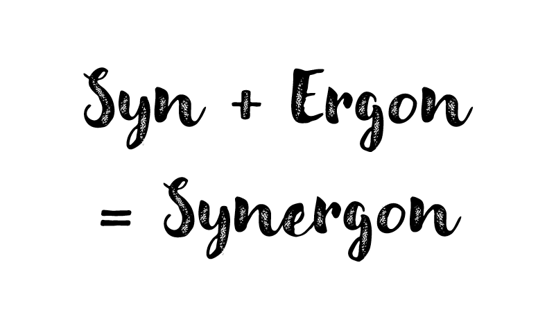
Derived from Greek, SYNERGON signifies collective action: SYN means together, while ERGON represents work. This etymology reflects our dedication to partnering with our clients to secure meaningful results. By pairing this with STRATEGY, we ensure these outcomes are tangible, actionable, and quantifiable. Through our structured approach, our clients can clearly track their own success and evolution.
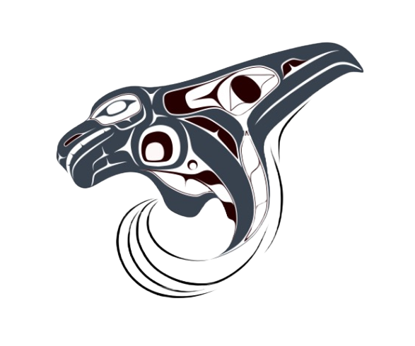
The Synergon Strategy logo, featuring a Northwest Coast formline design depicting a breaching orca with an eagle inspired dorsal fin, is a First Nation artwork commissioned by the Founder to embody the company’s core mission. Created by Cory Douglas (modernformline.com), a Squamish Nation artist with Haida and Tsimshian ancestry, it reflects a deep spiritual bond between the Founder and these powerful animals. Positioned on the right, the Eagle symbolizes hope, foresight, and a future of vast potential. Conversely, the Orca on the left signifies unity, partnership, and communal growth. Through a palette of burgundy and grey, the design pays tribute to the sacred nature of these animals. This visual identity strikes a perfect balance between honouring ancient heritage and embracing modern artistic innovation.